Professional Video Monitors
Using 100% of the sRGB colour space, these monitors represent your film at its best
In everyday life, colour management isn’t an issue that touches most people. We switch on our tablet, laptop or desktop computers and, thanks to the hard work of colour scientists and engineers, accept that what appears on the screen in front of us is an acceptable representation of the real world. But for imaging professionals (video editors, digital prepress, photographers, colourists and VFX/Graphic Artists) engaged in colour critical work, the potential world of workflow woe appears at every turn. Not all monitors are created equally. With standard computer monitors, subtle colour casts can multiply across space and time with unwanted surprises. Out in the field or in post, working alone or as part of a globally dispersed team, everyone needs to see exactly the same image characteristics every time.
Don’t panic! Help is here. This guide will concentrate on the best available displays. We’ll talk you through the various tech on offer and discuss features such as bit depth, colour accuracy, pixel density and the screen size and resolution best suited to various production/post activities. Choosing the correct type of display will have a major impact on your work.
A word about terminology: monitor, panel or screen is used interchangeably throughout this guide to mean the physical display. An important distinction is made between GUI (Graphical User Interface) Display and Reference Monitor, which are specifically used to define the role and function of the screen. The GUI Display (pronounced “Gooey”) incorporates the on-screen rooms, menus and tool pallets used to manipulate the image while the Reference Monitor usually provides a dedicated full screen preview of the image or video. For photography workflow a single screen can indeed perform both tasks, but in a video pipeline it’s common practice to have multiple monitors assigned to each role, and the requirements of a Reference Monitor can differ markedly from those traditionally required from a GUI Display. Knowing what those differences are is the first step to deploying the correct technology suited to the task, and achieving colour confidence.
LED Backlight LCD Displays
First, let’s talk about the various panel technologies on offer - VPN, TN, IPS – all occupy a space in the market appropriate to their cost and performance. A common trait of LCD monitors is the fluctuation in brightness and colour across different parts of the screen. In the past this made LCD a poor choice for imaging professionals. The extra engineering required to minimize these effects is reflected in the higher cost of professional grade monitors. Due to their low cost, TN (Twisted Nematic) monitors are the most common displays on the market. Screen flicker may have been consigned to the recycle bin of history, but unfortunately TN’s limited colour depth causes banding and posterisation and the slightest off-centre viewing can cause severe colour shifts. For these reasons TN displays are not recommended for use in conjunction with professional NLE systems employed in a colour critical workflow. A more suitable display technology for photo and video is IPS.
IPS Professional Monitors
IPS (In-plane Switching) panel technology was initially created to improve the weak viewing angles of TN panels and to further improve colour reproduction and image quality. An IPS display offers viewing angles of 178-degrees horizontal and vertical and is significantly less likely to exhibit any colour or contrast shifts when viewed from off-centre , and fast grey-to-grey response times ensures crisp yet fluid video playback.
Colour Space & Bit Depth Precision
sRGB (Standard Red Green Blue) is a colour space commonly used in display technology, but is only one example of a standardised use of the RGB colour model.
By defining the three Red, Green and Blue primary colour xy coordinates on the reference space CIE chromaticity diagram (see below), a triangular “footprint” within the spectral locus is generated. The space contained within the triangle represents a 2D slice of the three dimensional digital palette of available or realisable colour combinations, including black and white points. Referred to as the panel’s gamut, this is the range of colours a display is capable of reproducing which may, or may not, include all the colours defined by a specific colour space. Colours that can’t be displayed are said to be “out of gamut”. A percentage of the colour space(s) covered is usually included in the display specification and is a useful marker of their colour accuracy.
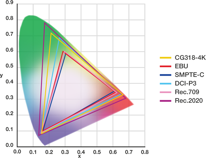
Yxy-CIE Chromacity Diagram above shows the values for the gamuts most often associated with post-production. The horse shoe shape is called the spectral locus and represents the entire range of perceptible colour. © Eizo 2015
Bit depth relates to the total number of discrete grey scale tones a display is capable of reproducing. Each pixel (picture element) contains 3 sub-pixels assigned to the primary colours - Red, Green and Blue. Bit precision therefore has a direct correlation to the digital palette of colours available and the ability to render smooth gradients without ugly tone jumps. Most professional monitors use an 8-bit panel, which equals 256 (28) steps between the deepest achievable black level and the highest white point, producing, when multiplied by each RGB sub-pixel, an array of Approx.16.77 million colours (256 x 256 x 256 = 16,777,216). Because the three sub-pixels are used to calculate bit precision, 24-bit is the technically correct term to use when discussing 8-bit technology. With a baseline of 100% sRGB and true 8-bit colour depth, the target audiences of professional general-purpose IPS panels are consumers, enthusiasts and business users who are more appreciative of the improved overall image quality, colour accuracy and wider viewing angles.
For professional users engaging in colour critical projects however, an even higher standard of colour accuracy from a reference monitor is required, and high-end wide gamut 10-bit displays (210) with support for colour spaces such as Adobe RGB, P3 and Rec. 2020 are employed in photography, prepress and post-production. It may not sound like much, but 10-bit precision makes a vast difference to image quality, achieving 1024 grey scale increments for a total of 1.07 billion colours, 64 times as many colours as you get with 8-bit display, resulting in even smoother colour gradations on screen.
10-bit Colour Accurate Monitors
Unfortunately you can't just plug a deep colour 10-bit display in to your system and ta-dah! expect ugly colour banding to vanish. Your operating system, GPU (or Video I/O Device), GPU drivers and application software need to support 10-bit output. The connection between monitor and PC is also important. If you have a DVI connection you are limited to 8-bit. DisplayPort and HDMI 1.3 support 10-bit colour, and Windows 7 and later operating systems offer 10-bit support. Apple recently included limited support for 10-bit output on some of its own displays (e.g. Retina 4K & 5K iMac) on OSX El Capitan. For GPUs, both NVIDIA Quadro and AMD FirePro graphics cards support 10-bit (30-bit) output.
Because of the similarity between the sRGB specification and the broadcast standard for HDTV (EBU, Rec. 709), video producer/editors also continue to enjoy the use of general-purpose or gaming 8-bit IPS monitors in all areas of the production chain. However, post-production editorial is changing. With more and more editors and producers performing colour correction and grading on high resolution, HDR, log or RAW media, the requirement for high-end 10-bit monitors is growing beyond the needs of dedicated grading facilities.
Screen Size, Resolution and Pixel Density
Screen size, resolution and pixel density are interlinked: you can’t change one value without having an effect on the others. Screen size is given as a diagonal corner to corner measurement of the screen. Resolution measures the number of pixels (W x H) contained in a screen and usually conform to standard screen ratios (e.g. 16:9), and pixel density is a measure of the number of pixels contained in fixed measurement, described as PPI (pixels per inch).
All three figures have an impact on image detail but there’s a fourth concept to consider which is viewing distances (a typical desktop distance of approx. 55cm is assumed). We’ll use your smartphone, which has a small screen, to illustrate the point. With such small devices, due to the fact that they are typically viewed closer to your eyes than a laptop or desktop screen, and in order to cram in the required resolution, they have a correspondingly high pixel density (typically 330PPI or higher on mobile devices). Apple’s Retina Display isn’t a fixed standard and shifts according to viewing distance, screen size and resolution, but Apple's goal of making pixels invisible to the naked eye is a lesson we can all take on board.
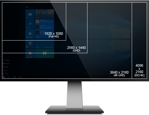
The minimum GUI resolution recommended by most NLE software is 1280 x 1200, but that wouldn’t allow you to monitor (pixel for pixel) HD video at full screen. With a 1280 x 1200 screen you are also limited to smaller screen sizes. This isn't optimal for comfortable on screen real estate management of tool palettes and windows, so we recommend the following:
| GOOD | BETTER | BEST |
|---|---|---|
| 1920 x 1080 (FullHD) | 2560 x 1440 (QHD) | 3840 x 2160 (4K UHD) or 4096 x 2160 (DCI 4K) |
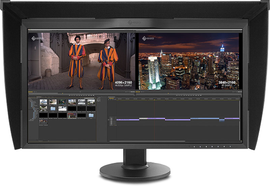
Two types of 4K. Which is right for me?
3840 x 2160 pixels (4K UHD)
4K UHD is 4K as defined by the ITU (International Telecommunication Union). It has twice the horizontal and vertical resolution of Full HD and has been adopted by the television industry.
4096 x 2160 pixels (DCI 4K)
DCI 4K is 4K as defined by DCI (Digital Cinema Initiatives). The horizontal resolution is higher than 4K UHD. This resolution is twice the horizontal and vertical resolution of projectors (2048 x 1080 pixels - 2K) and has been adopted by the film industry.
So for a desktop Reference Monitor, the screen resolution you choose should ideally match (or exceed) the highest NLE timeline resolution you work with. i.e. HD, 2K, UHD or 4K.
The standard screen arrangement for editorial and post-production workflow is a dual screen GUI Display and a Reference Monitor. Add a flat screen TV as a Client Monitor into the mix if you have large numbers of viewers in your suite. Choosing the correct screen size and resolution for your workflow is easily achieved by answering a few practical questions, but don’t neglect to consider personal comfort. How far are you from the screen? What’s the available desktop space? You spend a great deal of time in front of the screen, so it’s a worthwhile investment, both in terms of time and money, to get it right.
Why Choose a Professional Video Monitor?
Stop fighting with your monitor. Why waste valuable time correcting for the inherent colour casts and foibles of your screen? For mission critical colour and black, it’s the right tool for the job. Without a professional reference monitor you can’t be 100% confident about your colour decisions. This is the Mastering Tool of the visual arts. Colour workflow begins and ends with your ability to judge your images accurately.
Professional Graphics Monitors
We’ll use the characteristics of the Eizo ColourEdge CG318 4K to demonstrate the distinguishing features of Pro Graphics monitors and the benefits of using a professional display as a Reference Monitor.
Hardware Calibrated
Internal calibration adjustments made inside the monitor and not on the graphics board (GPU) output. Internal hardware calibration avoids tone jumps and unwanted colour casts that are unavoidable with software only manipulation of the RGB channels. The CG series have a built-in sensor that can be set to calibrate automatically.
Wide Colour Gamut
With 10-bit simultaneous colour display from a 16-bit LUT (look-up table), the Eizo CG318-4K can show more than one billion colours simultaneously.
High bit depth is essential for smooth contouring and increased colour accuracy. The internal electronics adjust and remap colour and luminance at an even higher precision for true 30-bit display output.
Corner to Corner Uniform Tone
CG318-4K uses Eizo’s patented digital uniformity equaliser (DUE) to ensure a Delta-E difference of 3 or less across the screen.
Edge to edge tonal fidelity is difficult to achieve with LCD technology, but is critical for consistent and accurate representation of dynamic range and colour across the wide viewing angle afforded by IPS.
Wide Viewing Angle
178-degrees means artist and client see the same colours.
Be confident that the colours you are fine tuning during a grade are the same from almost any perspective. For collaborative sessions, that means colleagues and clients see the same tones and colours that you see.
High Contrast
In compliance with the DCI standard, CG318-4K offers a high contrast ratio of 1500:1 for producing true blacks that are otherwise difficult to display on a typical LCD monitor. High contrast allows dark tones to retain their depth even in less than perfect viewing environments.
High Pixel Density
149ppi offers sharp detail and edge definition.
High pixel density ensures that you don’t have the dreaded ‘screen door’ effect when working at normal viewing distances.
Broadcast and Cinema Presets
Preset modes for EBU, Rec. 709, SMPTE-C, and DCI.
Working in the appropriate colour spaces and gamma values can help to avoid nasty surprises at the mastering or screening stage.
Choosing a Professional Video monitor
The choice between a glossy or matte screen finish is subjective, but the effects on the image can be pronounced. A glossy screen will render deeper blacks and more saturated colours. That would seem to go against the concept of a colour critical workflow where the mastering tool (your reference monitor) should be colour and grey scale agnostic. These artificial enhancements should be avoided.
Glossy screens may help to eliminate diffuse reflections but can suffer from specular reflections. A matte finish will help to eliminate diffuse and specular reflections, while rendering a more neutral image avoiding false readings of black levels and colour saturation. Some users also note that glossy screens can contribute to eyestrain after prolonged periods of viewing. In all instances, control of your viewing environment lighting is key.
Incorporating information on all the features we have discussed above, the questions you need to consider to meet the basic requirements for effective video editing and colour critical work are simple; do I have enough screen real estate for the comfortable arrangement of my GUI and do I have reliable colour rendering? As a simple rule of thumb, for graphic artists and photographers who use the screen as both GUI Display and Reference Monitor, choose a 10-bit hardware calibrated IPS display, such as the Eizo CG series, NEC SpectraView Reference, Dell UltraSharp (models featuring PremierColor technology) or HP DreamColor (Z32x UHD Display). Eizo’s CS/CX range are marketed towards prosumers, amateurs and enthusiasts who want to achieve better results from their images, and the CG series to professional photographers and filmmakers who demand the most accurate colour from their monitor.
In an video pipeline our recommendation for a Reference Monitor is a 10-bit hardware calibrated IPS display with near total coverage of the target working colour space, 27" or larger with a resolution equal or greater than your working NLE timeline resolution. For a GUI Display we recommend a professional 8-bit IPS monitor with a gamut that covers a minimum 100% sRGB, 24” or larger with 1920x1080 or higher resolution. 3840 x 2160 allows the greatest screen space for tools and windows.
Whichever level of panel you choose, with daily use the characteristics of all monitors drift over time. These subtle shifts in colour temperature and brightness mean regular calibration is required. Scan offer a range of sensors and software from X-Rite, Datacolor and SpectaCal to help maintain a consistent colour managed workflow. While general purpose IPS monitors will benefit from regular software calibration, professional users should choose a monitor that supports internal hardware calibration.
Controlling the viewing environment
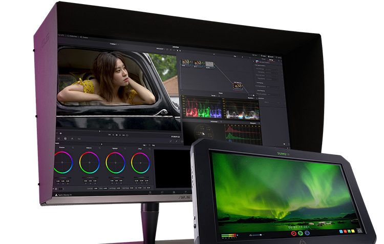
Last but by no means least, don’t ignore your viewing environment. It is probably the weakest link in the colour management ecosystem. If you don’t have access to grading suite conditions, the next best thing is to minimize all strong light sources and position any remaining ambient light out of your line of sight. Turn off all main overhead lighting. If the space has windows, close blinds and curtains and don’t allow any reflections or glares from ambient lighting to fall on the screen. A monitor hood is a useful tool in this respect, as it masks the screen from stray ambient light. Before you make any colour decisions, allow your monitor to warm up for at least 30 minutes and give your eyes time to adjust to the controlled environmental conditions.
The Future of Displays
Technology is a moving target. Manufacturers such as Sony, LG and Panasonic are developing next generation 4K TVs using OLED or Quantum Dot technology to meet the UHD Alliance’s Ultra HD Premium standard, which features HDR (high dynamic range), HFR (high frame rate) and wider colour.
As is often the case in our industry, the tail wags the dog. As consumers adopt the tech to receive UltraHD Premium content (and sales are forecast to triple this year) production costs will continue to fall, and there will be a cause and effect cascade for content makers to adopt the production tools capable of capturing and processing the 4K big data required by the new UHD standard.
Implementation of Rec. 2020 with tantalizing higher dynamic range and a wider colour gamut, promises even greater performance for reference displays. Dell recently announced the 30" UP3017Q OLED as part of its UltraSharp range, and we expect other manufacturers to follow suit in the near future. Stay tuned.
Pro Video #LifeHacks
An monitor used for graphics and video in a colour managed workflow should be calibrated at least once every 200–300 hours (in ordinary use, once per month). Re-calibrate after moving the monitor or if there’s a significant change in the ambient lighting, as the monitor profile generated takes this factor into consideration.
In strong lighting, especially outdoors, always use a monitor hood. In the same way that Flags are employed to create negative fill in lighting set-ups, wear dark clothing when using a monitor out in the field; the screen will reflect your chest and display more contrast.